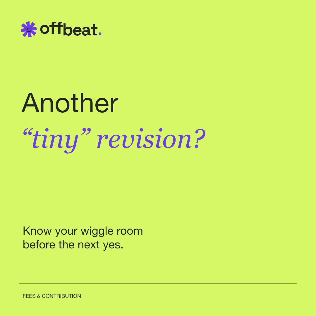
“Another ‘tiny’ revision?”
A familiar situation. One knowing smile. Then a useful answer.
 Start free
The commercial sidekick for Southeast Asia’s independent agencies. Clear enough for the numbers. Characterful enough for the people doing the work.
It’s the aside in the margin. The extra bit of context. A small reminder that good work and good business can share a desk.
The complete wordmark stays steady. The supporting asterisk gets one small entrance, then lets the work take over.
Motion respects your device’s reduced-motion setting.
 A SMALL HELLO. THEN, STILL.
Paper does the hosting.
Violet directs. Lime annotates.
Use ink on paper or lime, and paper on violet. Keep status labels explicit: color alone should never explain a payment, risk or approval.
A clear fee. A current file. A decision everyone can find.
SPACE GROTESK / DM SANS / GEORGIA ITALICSpace Grotesk gives headings and numbers their structure.
DM Sans does the everyday explaining.
Georgia italic adds a brief editorial aside. Use it sparingly, never for financial values.
A familiar situation. One knowing smile. Then a useful answer.
Concrete words. A visible next step. Define contribution before calling it profit.
Payment, access and client problems get factual language, a reason and a next action.
A familiar voice, a clear palette and a little personality, wherever you meet Offbeat.
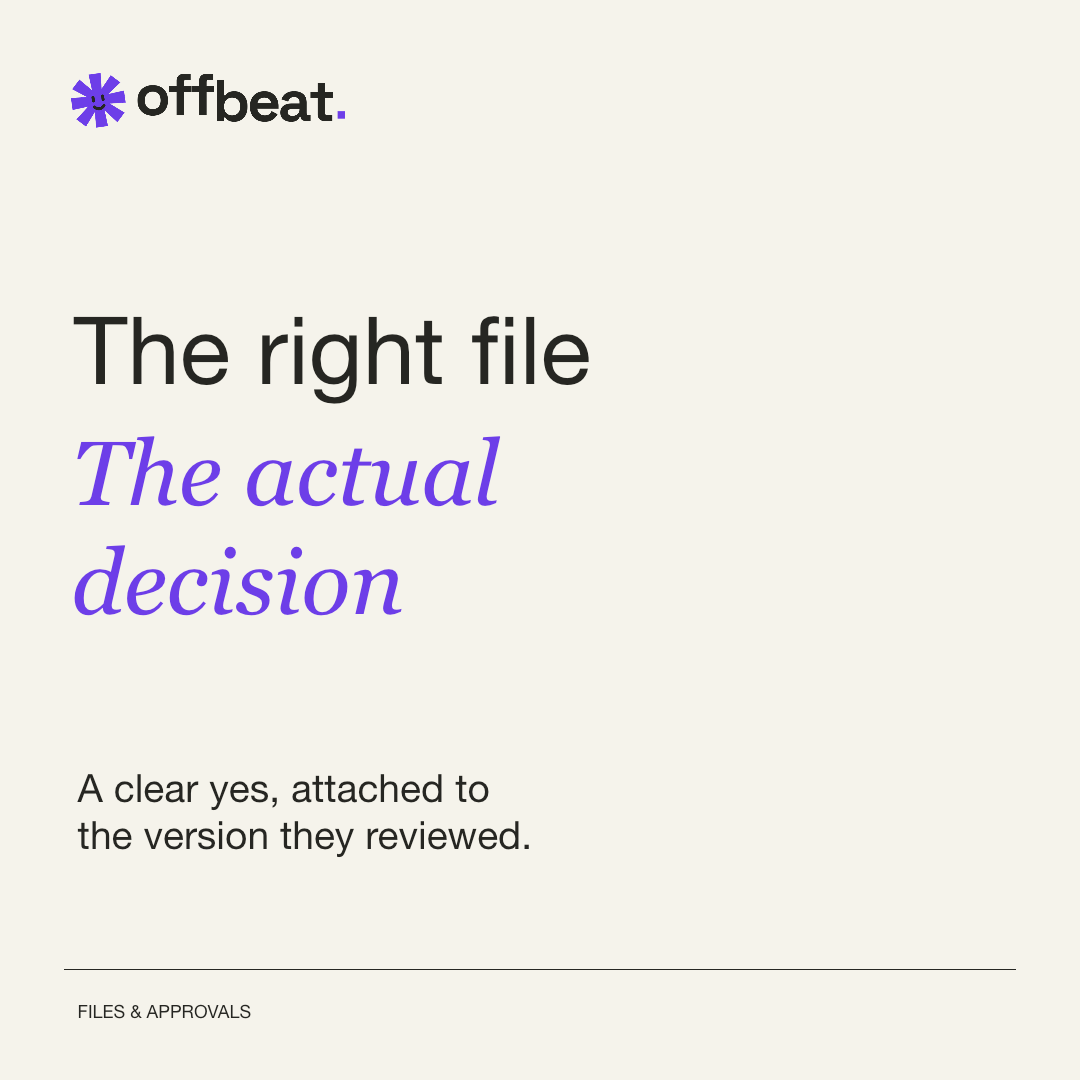
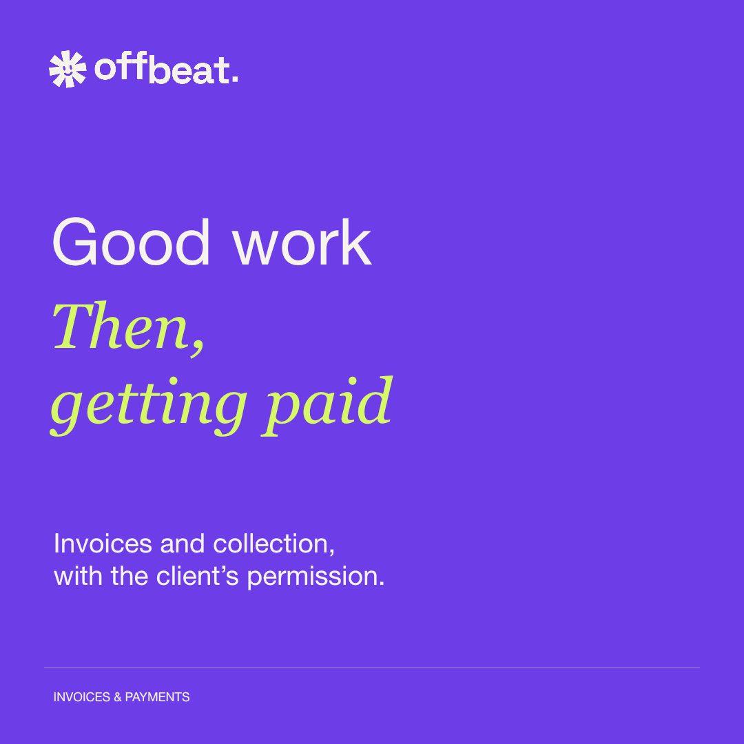
A clock for the hours. A stamp for the yes. Sixteen useful relatives of our asterisk, with the same angular arms and a little personality.
The smiling asterisk remains our brand mark. Feature icons borrow its silhouette, use one color and always sit beside a plain-language label. Keep their proportions intact; let the shape do the talking.
Meet the features behind the marks ↗No card required. Yours to explore for 30 days.